Chapstick Summer Flavors
Art Direction • PACKAGING
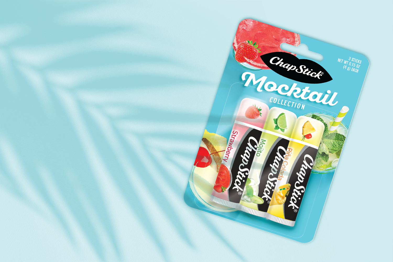
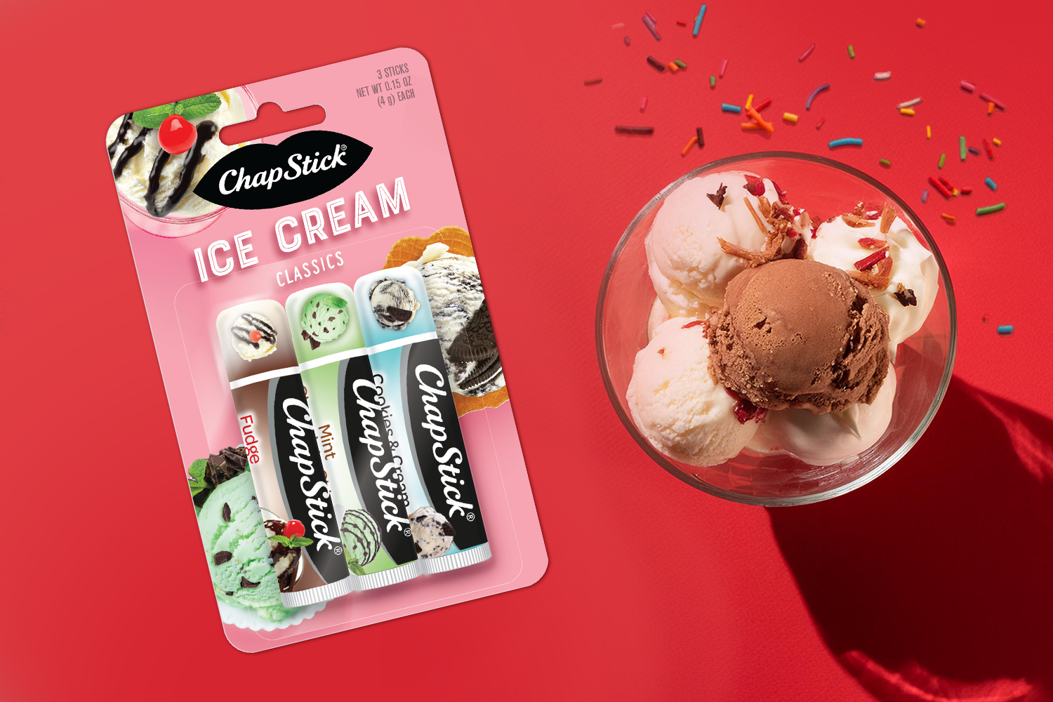
Each year, ChapStick releases new collections of flavors nationally. However, the branding of the three-pack was hampered by an outdated look with floating, photo-realistic flavor illustrations and flat vector backgrounds. To reclaim retailers’ interest, the visual language of the backer cards needed to be more in line with the modern user’s expectations and preferences, while still highlighting the burst of joy and flavor essential to the ChapStick brand.
Contemporary photography and illustration styles were applied to a range of design concepts, some with more literal interpretations of individual flavors vs. flavor storytelling. A point-of-view delivered by a top-down photography angle and dramatic shadows gives each flavor image a sense of place on the backer card. Paired with solid saturated backgrounds, the new look is more sophisticated but still joyful and delectable. The new look and feel is in the marketplace with the Ice Cream Classics and the Mocktail Collection and is designed to extend to new releases.