EMERGEN-C KIDZ
Art Direction • Packaging
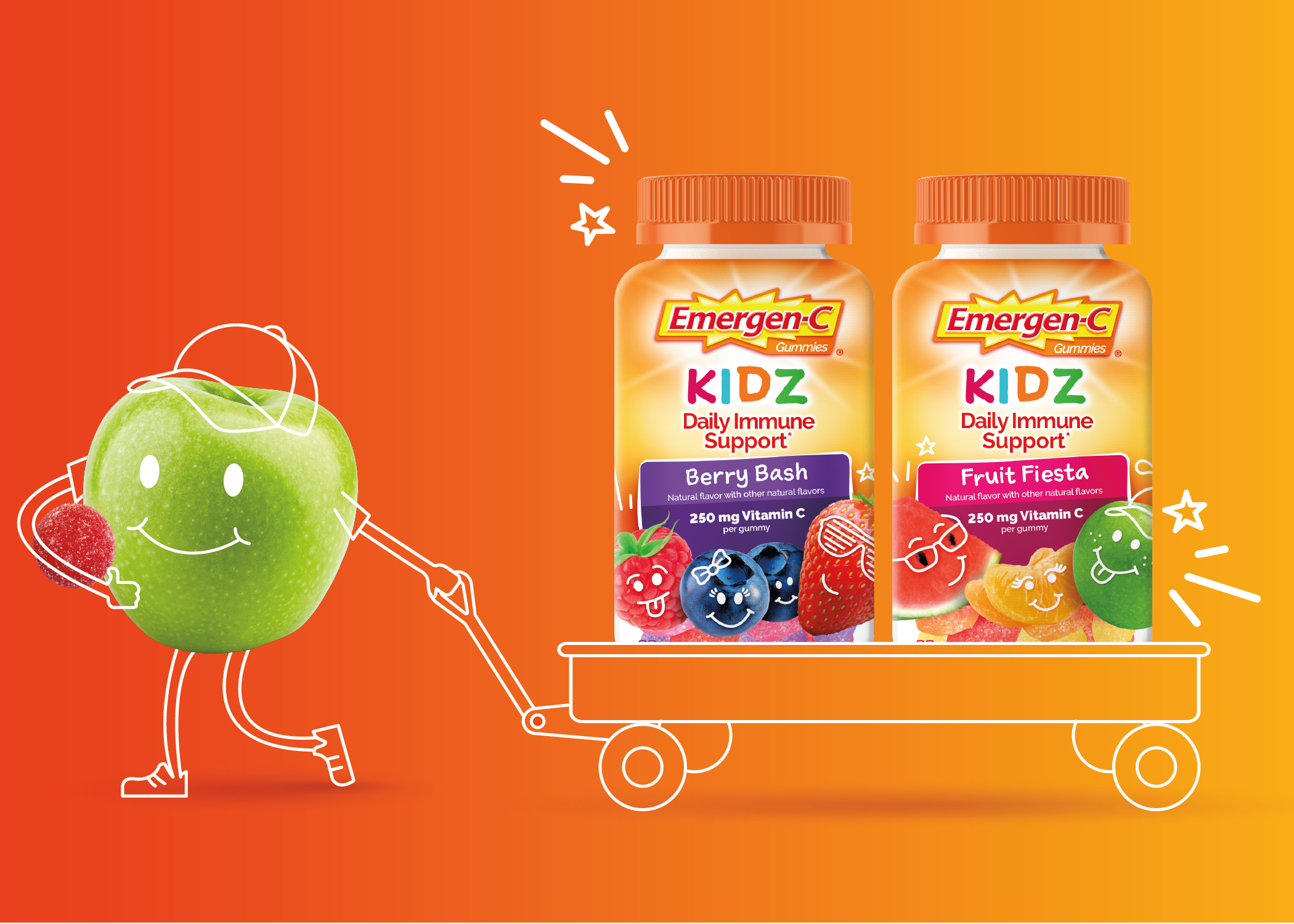
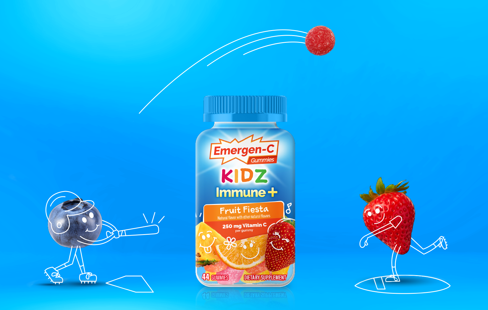
GSK sought a brand refresh for Emergen-C KIDZ to align more closely with its new adult master brand visual identity while maintaining a child-friendly sense of playfulness. A broad range of strategic creative concepts and illustration styles were explored.
The client ultimately landed on branding that strikes a balance between the Emergen-C brand color palette and communication hierarchy and the wonder and fun of child-like animations, off-kilter shapes and handwritten typography. The result is undeniably an Emergen-C KIDZ product that doesn’t fall far from the tree of the master brand.
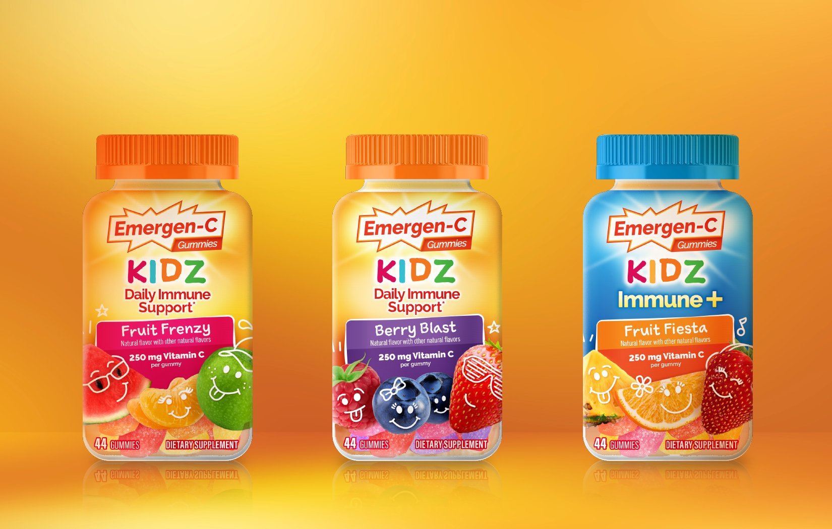
After
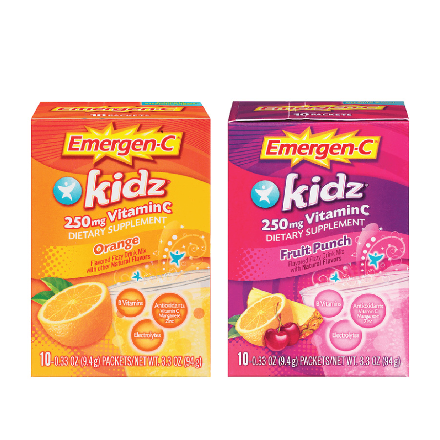
Before